The colors of 2026 in interior design: trends that inspire harmony and style

Color plays a key role in interior design. It influences how we feel, how we perceive light, and the sense of space within a home. In 2026, color trends focus on balance, calmness, and timeless elegance, reflecting the way we want to live and experience our homes today.
These are the main color trends shaping interior design in 2026.
Natural tones and soft earth shades
Nature-inspired colors remain at the forefront. Warm beiges, sandy tones, soft clays, and light browns create calm and welcoming environments. These shades are easy to combine and ideal for spaces designed for comfort and relaxation.
Nature-inspired colors remain at the forefront. Warm beiges, sandy tones, soft clays, and light browns create calm and welcoming environments. These shades are easy to combine and ideal for spaces designed for comfort and relaxation.
Organic greens
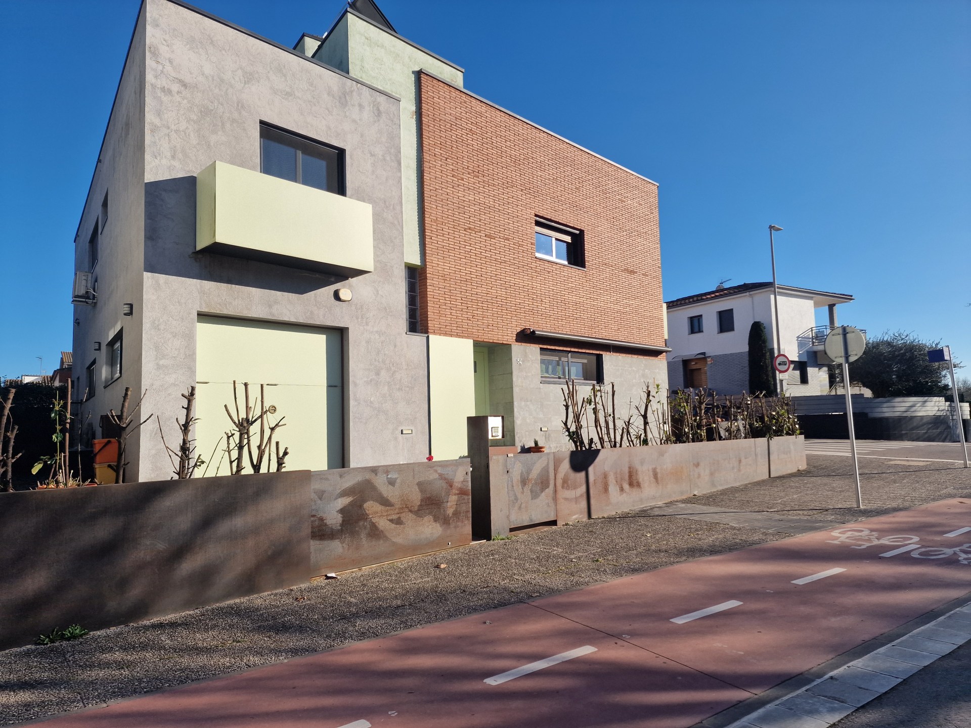
Green continues to be a key color in 2026. From olive to moss and eucalyptus tones, this palette connects with nature and promotes a sense of balance and well-being. It works beautifully on walls or through subtle decorative accents.
Green continues to be a key color in 2026. From olive to moss and eucalyptus tones, this palette connects with nature and promotes a sense of balance and well-being. It works beautifully on walls or through subtle decorative accents.
Deep blues and mineral shades
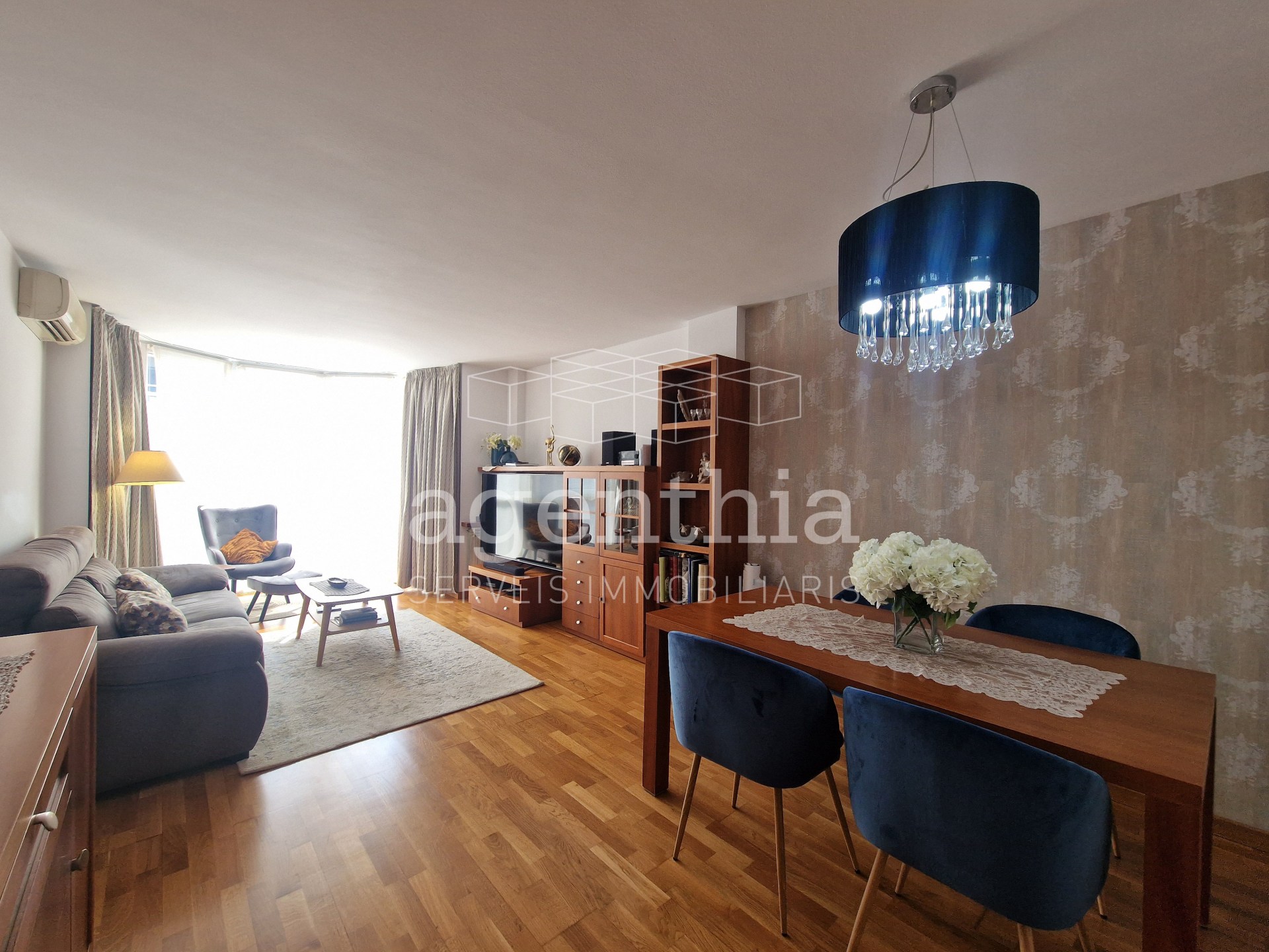
Blues evolve into deeper, more mineral tones such as midnight blue or blue-grey. They add sophistication without feeling cold and are perfect for creating elegant contrasts in neutral spaces.
Blues evolve into deeper, more mineral tones such as midnight blue or blue-grey. They add sophistication without feeling cold and are perfect for creating elegant contrasts in neutral spaces.
Warm neutrals redefined
Pure whites give way to off-whites, creams, and warm greys. These tones maintain brightness while creating a more inviting and comfortable atmosphere.
Pure whites give way to off-whites, creams, and warm greys. These tones maintain brightness while creating a more inviting and comfortable atmosphere.
Soft accent colors
2026 also brings subtle accent colors like muted pinks, soft terracottas, and gentle yellows. Used sparingly, they add warmth and personality without overwhelming the space.
2026 also brings subtle accent colors like muted pinks, soft terracottas, and gentle yellows. Used sparingly, they add warmth and personality without overwhelming the space.
Design focused on well-being
Beyond trends, 2026 emphasizes creating homes that feel calm, balanced, and authentic. Color becomes a tool to enhance well-being and improve how we experience our living spaces.
Beyond trends, 2026 emphasizes creating homes that feel calm, balanced, and authentic. Color becomes a tool to enhance well-being and improve how we experience our living spaces.